The goal of this micro site is to communicate to our global audience that there is real environmental impact associated with the energy they use for computing in a particular region. And clarify what has proven to be a difficult topic to understand (available energy vs offset) by using data and visual storytelling.
Involvement:
_Art direction
_Motion direction
_Visual design
_Project management
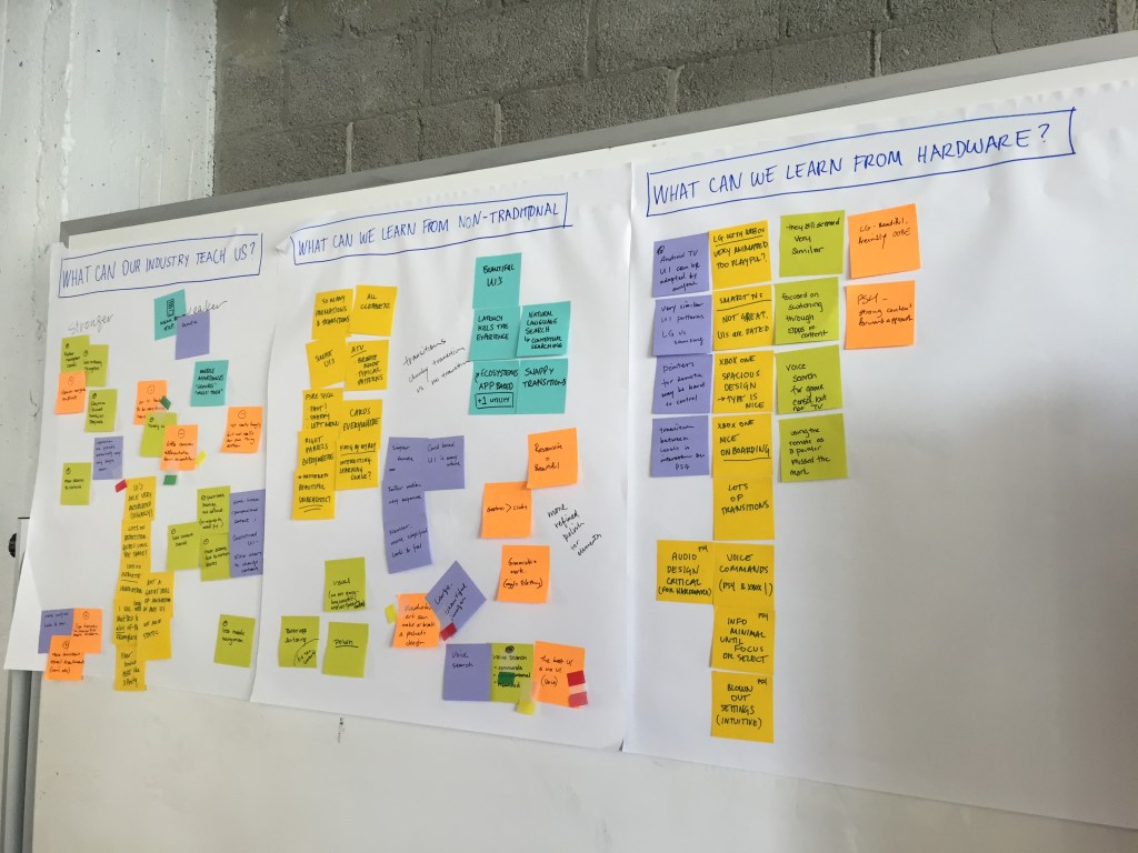
All new Fiber TV interface focus on 4 main pillars: Playback is King, Content Forward, Source Agnostic and Magically Me.
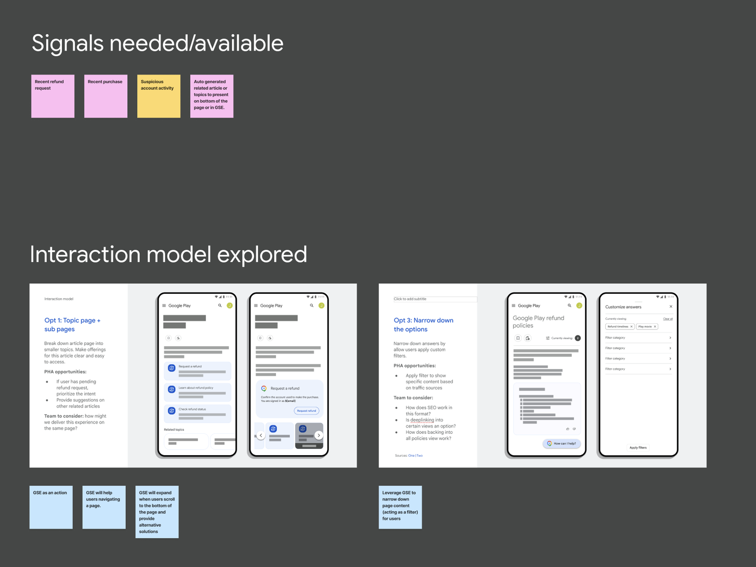
Work along side of Privacy and Security UX team to provide visual as well as content strategy options.
Built the visual language for the next generation of “One Google sign in experience”. Worked to unify x-functional team and came to consensus on strategy, visual direction and concepts.
“I am thrilled to see how much Lorraine loved the work and look forward to sharing it with others. It's also my job here forward to advocate for it, so we can see it go live and reach hundreds of millions of users.”
“Your work received great accolades today from Ben Smith. We wrapped a really good discussion with him telling us, "This is really great work!". Thanks, again, for your creativity, persistence and hard work!” - Thomas Ranese, Director of Global Marketing Communications
Involvement:
Design team lead, Art direction, Visual design, Concepts
Highlights:
Leading visual design efforts. Working with design team to brainstorm design concepts.
Consolidate/Organized 20+ ideas into 3 strong sets of concepts.
Working with xfunctional team on requirement, design and development related issues.
All 3 concepts have been well received by Lorraine Twohill (SVP, marketing), VP level stakeholders and GAIA team.
Prepare presentation deck for VP level stakeholder and L-team reviews.
Consult and prepare design comps for user testing
Support GAIA team on iOS sign in proposal
Micro site design for the premium device “Chromebook Pixel”. Created a black color concept for the base tone to enhance the premium nature of the hardware. Utilized parallax scrolling and other animation effects to build a fun, rich user experience.
"Google's first Chrome OS device combines high tech and high fashion” -
"Google's Chromebook Pixel looks cooler than an apple product.” -
Involvment:
Visual design from concept to finish; Art direction
View design
A fun, interactive experience to promote the latest products from Chromebook family - HP Chromebook11. Use clean visual languange to reflect overall branding and also compliment product and the features.
Involvment:
Visual and interaction design from concept to finish, Art direction
View design
A very interactive page takes users through a tour of the OS - a dramatically simplified features page compared to the previous version. We conducted user research studies and I used the feedback to inspire a revised design and user experience. Created a clean visual design in order to keep the user zeroed in on the screen content with no other distraction.
Involvment:
Visual and interaction design from concept to finish, Art direction
A fun, interactive piece to celebrate Chrome's 4th birthday. Using a z-index time line to showcase Chrome's amazing inovation over the past 4 years. Pushing technology boundries by using HTML5 animation. Collaborating with vendor (Left Field Labs) on development and art direction.
Involvement:
Visual design from concept to finish, Art direction, Concepts, Illustration
View design | Visit site
An complete visual and IA revamp of Chrome's web presence. Working closely with Chrome marketing team to create a brand new image for Chrome: chrome.com. Focus on the core values of the product: speed, simplicity and security. The project includes a complete style guide and 3 sites: chrome.com, Chrome for Business, Chrome for Education.
"Fantastic work building a website for Chrome that is modern and beautiful in its simplicity, just like Chrome! It's the first time we've shown all of Chrome's components -- browser, devices, and web apps -- come together under one brand and it's wonderful to see. Beautiful work.” - Tom Oliveri, VP, Marketing, Chrome, Apps & Enterprise
Involvement:
Visual language, Art direction, Visual design, Concepts, Illustration, Information Architect
Highlights:
Enhanced content strategy and visuals that deliver a better user experience for Chrome.
Since launch, the average time on page increased from 00:00:20 - 00:02:30
Page Views increased +540% from the previous version
After the One Chrome for Business launch in Q4 2011, daily site traffic has quadrupled.
In store commercial / product demo concept for Bluray and smart TVs.
A series of navigation study that helped define the main navigation on store.sony.com. The study is trying to help use find the product they came to site for easier and faster. Trying many different combinations of image and text. Explored "progressive navigation", "fat nav" and "Mega nav".
A promotional web page that help our users understand the product and it's features. The page serves up many interactive modules that help our users understand how to use Chromecast to view your favorite content from a smaller screen (phone, tablet) to a larger screen (your TV).
Involvment:
Visual design, Art direction, Concepts, Illustration, photography
Interactive piece to help promote and demonstrate key features of the product.
_Homepage promotional visual
_Page design
_Hero interactive module concepts